Brief
To design the packaging for a luxury urban honey brand, thinking outside the glass jar and beyond the bee.
Concept
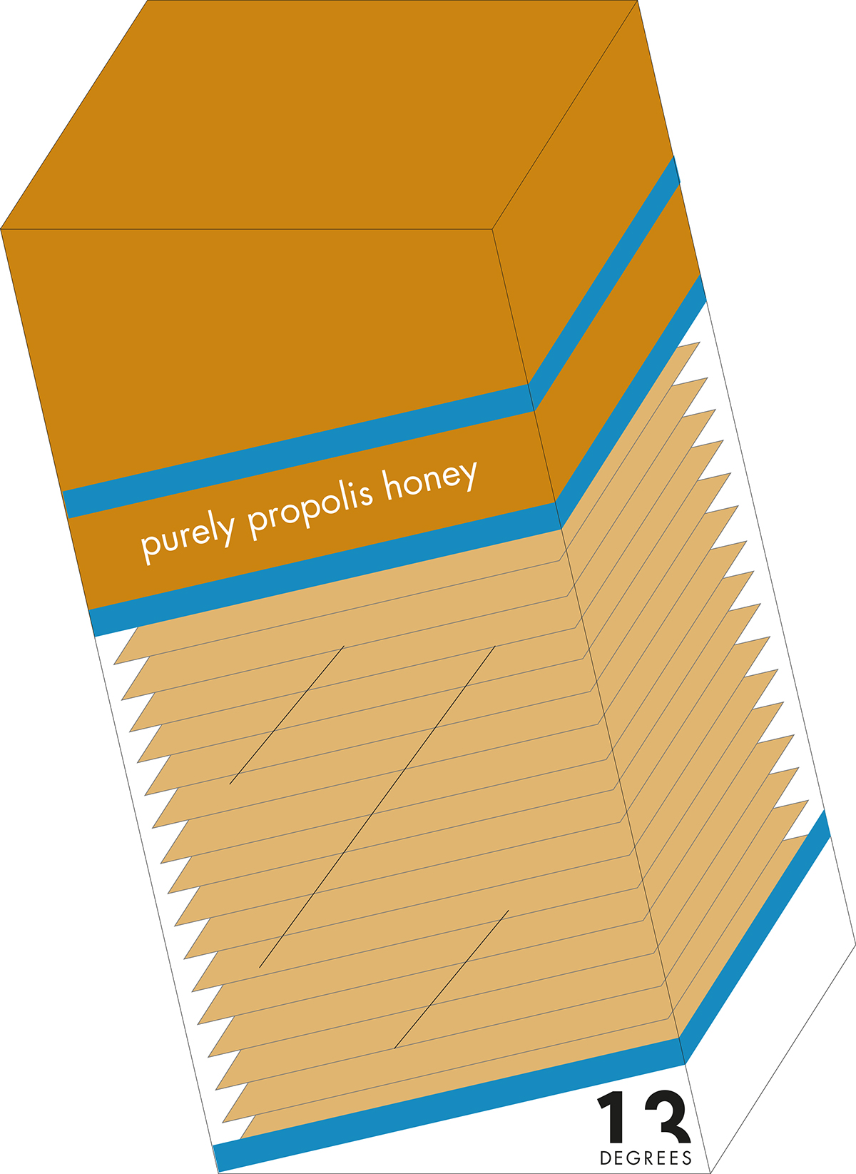
All honeycomb cells are built at an incline of 13 degrees from horizontal to prevent honey from dripping out. This keeps the hive tidy.
Solution
This brand's unique selling point is that it makes honey easy to handle and mess free. The honey is packed in sachets, which are also useful for the busy lives people in cities lead, allowing them to take the product on-the-go, whether this is to enjoy it on toast or in their hot drinks at the office. Likewise, it can be taken as a snack for a quick energy boost. The tea range taps into this, allowing them to take both out of the house and even consume together.

Marque
The diagonal changes colour according to the type of honey or tea. The number and word 'degrees' is always used in black on a white background. The marque was inspired by how angles are written in mathematics.

Name Holders


Form and Function
The box serves an aesthetic purpose, but it is also functional, acting as a honey sachet dispenser. This means the honey sachets can stand tall at home, but can also be taken out one by one to consume on-the-go.
Transparency and Access
Consumers can see the honey sachets stacked inside the dispenser through the plastic box. The sachets are also transparent to allow the honey to speak for itself, showing the natural colours, which are complimented by the printed blue colourscheme. To open the dispenser and release the sachets, the consumer literally tears back the 13 degree diagonal line.

Honey Pakcaging
Packaging on Display
Many brands still find that their packaging is kept away in the kitchen cupboard, behind doors. The packaging for '13 degrees' makes a statement with the box literally angled at 13 degrees. It is an item to put on display in the store and at home too.
Abstract Bees
Although the brief asked to think past the bee, as it is a food product, there needed to be some sort of link to the source. Because of this, the markings resemble those on a bee, with the edges of the sachets acting as the furry body.


Tea Packaging


